Stealing colors from a printed book
With so much of the art collections available online, it can be difficult to make room for large, coffee table sized, art books. They are heavy! You can’t usually text-search them! And while they are hip and lovely for a quick look at the bookstore (or at Urban Outfitters), it can be difficult to justify keeping one around.
I have a few myself, and keep them with me even though I’ve moved seven times in the past fifteen years. Here are the three things the big, heavy printed art books do for me.
1: Focus
I once asked a rare book collector what books about artists he found to be the best, which ones stay valuable over time. He said to concentrate on the monographs - books about or by a single artist - not books that haphazardly collect all art from a given period or theme.
Focus is valuable to me. I want to study the work, not get distracted by other themes. There is also no competition from all the other things I could potentially be doing. I have to physically turn away from the book to focus my attention on something else.
2: Scale
To print a book, the author has had to collect a lot of material. While there is good long form writing on the web, it can be harder to find. The layouts and formatting online are quite sophisticated. But for me, they do not yet match the curated immersive experience that a large, well produced art book offers. A catalog style art book offers a similar experience to a museum exhibition. Few materials online match that.
3: Color
I read color differently when it’s printed. Compared to my typical viewing experience on a screen, printed color still seems to be at a higher range from lights to darks. If a book is printed with different paper stock, you even get a variation in texture.
Color exercise
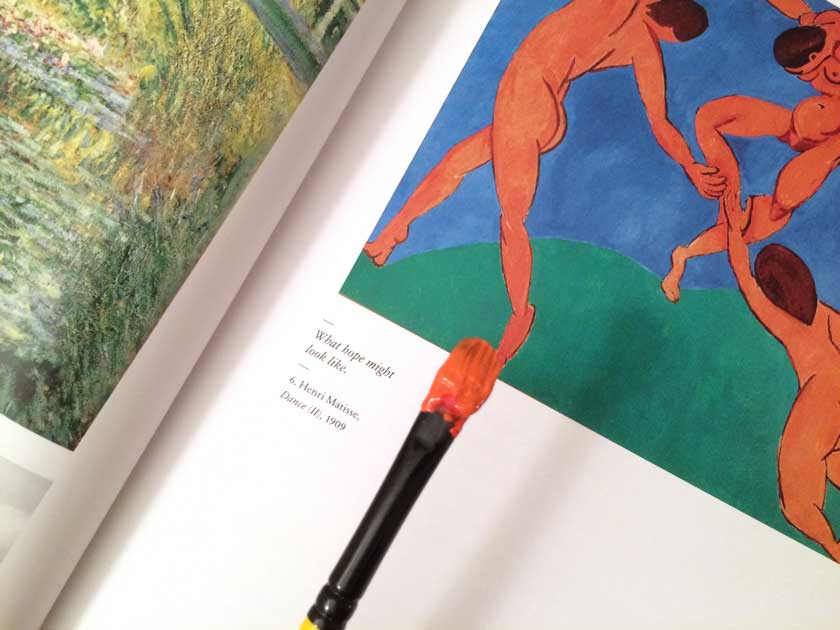
Print also allows me to do a favorite painting exercise: to practice mixing and matching color to match an artwork. I can get very close results because when I hold the brush near the printed page, I see exactly how well I matched the color. This does not work so well with a screen because it emits light, and I react to it differently than to paint.
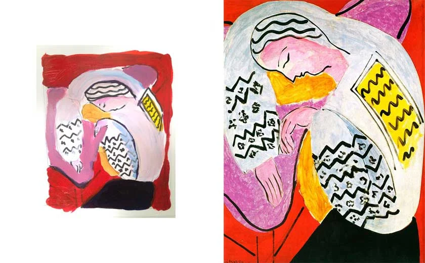
Here is a quick study I’ve done to match Matisse’s pinks and reds in La Dormeuse.
Another example! Yes, I do hold the paint carefully and had not yet painted a book!
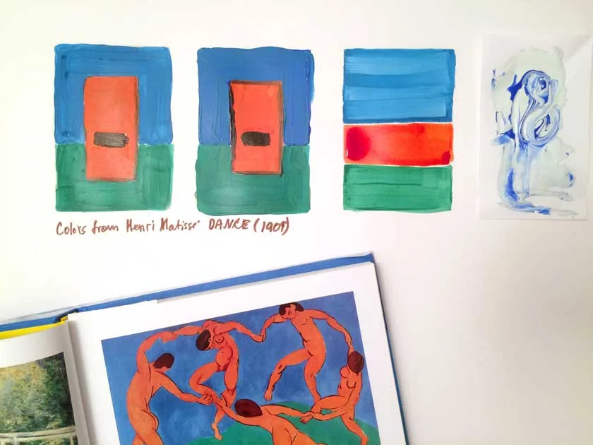
Mixing paint to match a color is slower than using a color picker in Photoshop. But the process of recreating (and failing) teaches me to be attentive to the ingredients that go into a shade I found attractive. I am starting to understand the relationships between the colors and why they might work together. If nothing else, this exercise is training my sensitivity to color palettes.
Design applications
I took away two things from repeating my painting exercise this week.
One is that printed materials still matter. They offer rich, curated and focused information that I can’t get just as easily online. I will make a point to try the book research route when I can.
Another takeaway is an even stronger appreciation of color palettes, and the ingredients that make them work well. Color is a tool we use for UX design every day, and any improvement in my understanding of how it works sounds like a good thing.