Abstract Sketches for UI Design
The everyday work of designing for the web can feel weird and two-sided.
On the one hand, what we do is often scientific and tested. If we’ve done our jobs, we can defend our design decisions with quantifiable things, point to business goals, and maybe even metrics that show how a thing has worked so well for us in the past.
On the other hand, we’re relying so often on intuition and “good taste” and hunches to move forward with a first draft, or to make an aesthetic decision that the process does not feel proven or scientific. It feels closer to making art! (To be fair, people who invent new science often operate on intuition as well - and then test things using the scientific method.)
What’s worse is - sometimes, I proceed to make those intuitive decisions minutes after I’ve talked to a client or a colleague about how everything there for a reason, and can be measured if we wanted to. It can feel uncomfortable. Like we should either be one or the other, either pure scientists or free-reigning artists. Or should we?
The best answer that I’ve found so far is to admit that the work designer does is both. We look for evidence, solve problems and ask practical questions. And at the same time, we are responsible for making things as beautiful as possible. We can often get there faster on intuition, by guessing what might work well and then trying it.

Abstraction
Wassily Kandinsky was the first painter to develop and contextualize purely abstract shapes. His work is explicitly both scientific and spiritual, working with intuition as well as logic. In addition to painting, he wrote extensively about the meaning behind non-figurative art.

Online photos often leave us guessing about the scale of an artwork. How does it feel in a room, in relation to me? Artsy solves this beautifully by showing art in a gallery setting Image via Artsy.net
Composition VII is (according to Wikipedia) his most complex painting. Every combination of shapes and colors that makes up the 79 × 119” canvas is unique - he does not rely on repetition to balance out the overall look. Perhaps, this is what makes his work timeless: numerous detailed studies in preparation for the painting come together in a unique, rich composition.
Non-representational art and flat UI design?
Kandinsky’s pioneering work with purely abstract shapes feels similar to what we do with color, shape and text to build web applications. I can see a parallel between flat design and abstract art: both were considered too different, non-user-friendly, and not serious enough at first.
Because of this similarity, and because of how rich the painting is, I decided to take it as source material and draw some flat design inspired layouts based on the relationships between shapes I find in Composition VII. Before attempting the exercise, my assumption is that I’ll recognize a few of the design patterns we use now hidden inside the painting.
An experiment

The blue is very strong and vibrant. It looks actionable on any background, but especially here, on red. Like a link!
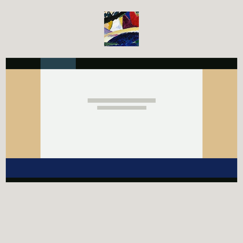
Warm neutrals and white sit inside a frame of strong, dark edge shapes. There seems to be a top and a bottom.

The color combinations and the active diagonal make this scene irresistibly cheerful.

Trying to simplify the shapes as much as possible. This is starting to look like an icon of a painting hanging on a wall.

The grid made up of similar things is a basic element on the web. I see it in this tilted green square.

Starting to loosen up a bit so I’m making shapes to follow Kandinsky’s compositions rather than force them to look like web wireframes as well.

This combination of shapes looks quite modern to me, almost like flat design style shadows. The diagonal red line is certainly a favorite. It’s beautiful in painting, but may not be great for user interfaces because of how strong the diagonal is combined with the red that’s normally reserved for errors. Perhaps, a red diagonal used as a branding rather than a repeatable interface piece would be more successful.

Kandinsky’s dashed (eye-lashed?) edge looks a bit like a dashed line. Perhaps I could focus on trying to replicate Composition VII as close to “native” HTML or canvas shapes as possible.
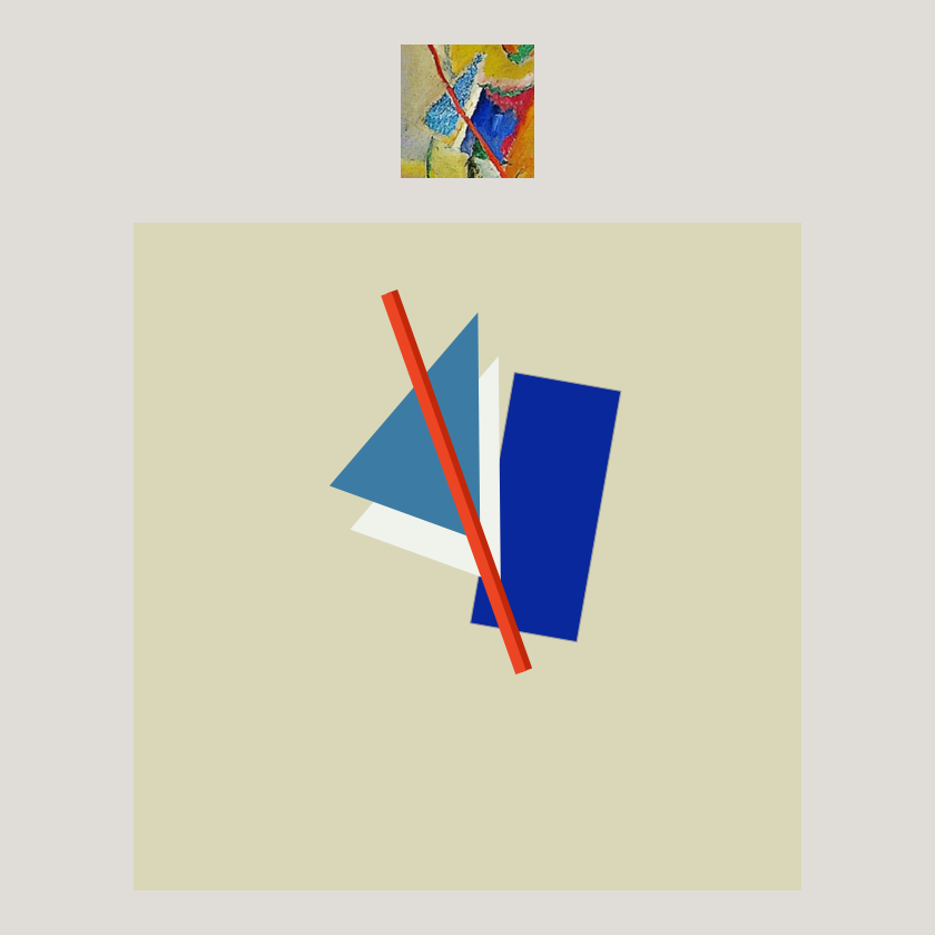
Favorite result so far! Again, the red diagonal ties things together charmingly.

This could be a slice of watermelon! Also, I am getting pretty far away from things that could serve as practical interface pieces, and playing with curves and diagonals. This also makes me think - we’re quite constrained to the boxes and lines and very straight things. For practical reasons, surely, but do we have to be like this all the time? Would a mix of super straight and slightly wonky shapes ever work well and in our favor?

The little circle makes the whole composition work. Everything seemed clunky and purposeless until I added it.

Without the heavy blue shape up at the top, this thing did not look right. More and more, I am convinced that by just copying these small compositions, I can train myself to see what makes a group of anything feel balanced, meaningful, and harmonious. Perhaps, this is, after all, good exercise to train for doing work in any medium!
What did I find?
I didn’t set out to establish a new UI style in an afternoon. But I did find a few curious things:
- Everything on the web is still very rectangular and not organic - even with advances in Canvas, HTML5 and CSS that could have made complex shapes possible. I could see it clearly from how unlikely it seemed (see the first three attempts) to make convincing combinations of Kandinsky abstract shapes and familiar UI design shapes.
- Why are we almost never using diagonals? They are fun and dynamic and feel happy. Perhaps, they present too many weird cases for fluid responsive layouts, but I am going to try using them a bit more.
- By the end of the exercise, I did see an improvement in how loose and playful my mini compositions felt, but I also realize that I got very far away from familiar layouts that accommodate blocks of text. We read in paragraphs, usually horizontally, and in one direction. I forgot the text in my shape sketches, but they could still serve as a graphic layer inside a more structured, gridded layout.