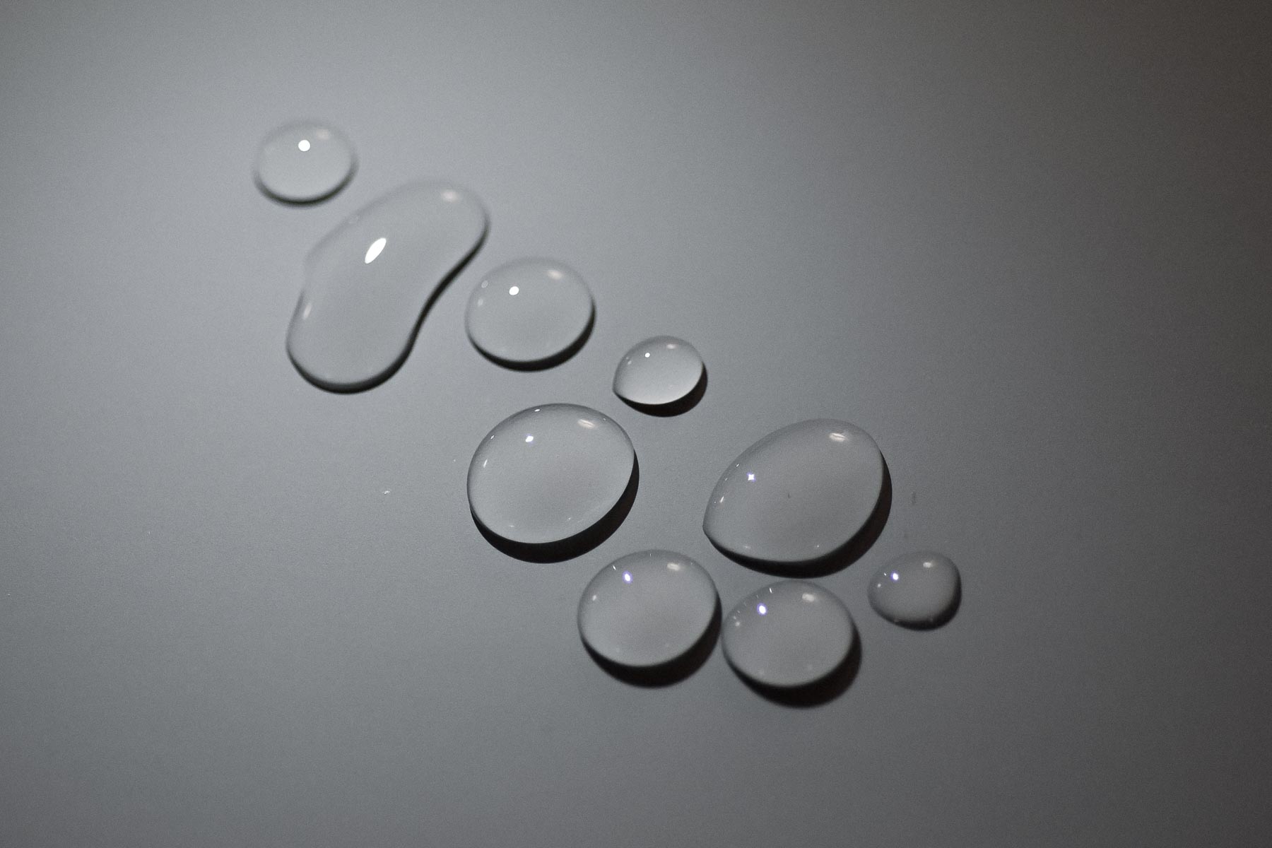
Are pixels shiny or matte?
Design for the web, we get a lot of cool stuff. The work is interactive and someone will use what I made as a tool to do something they need. Work on the web reaches a ton of people, in ways I can't even imagine - but it also means less control. I am one of many designers who've transitioned from print to web based design. And lately, I'm realizing that I can take more of my learnings from "analogue" with me than I had thought.
One form of control is precise layout. A lot of good guides exist on how to transition from the known boundaries of print, to the flexibiliy and unknowns of the web. And even though screens and browsers are getting better all the tima, and can do amazing things - the control we had on paper (things looking the same) would actually be a terrible thing for how we use devices. I don't want that back.
Another form of control is knowing what the surface of the thing I'm making will feel like.
I find myself drawn to matte surfaces these days. My latest painting experiment was with gouache paint, and I realized I’ve been attracted to painting not just for the colors (I have plenty of shiny acrylic paint colors for that) but for the quiet intensity a color gets when it’s painted matte on paper.
Similarly, screen-printed posters often feel like they’re “higher resolution” and much more vibrant that anything we see on screen. The individually pigmented inks and their opaque matte surface read differently in our brain than shiny pixels.
I miss this stuff!
Yes, in UX design we’re used to varied screen conditions (brightness, color balance, surface of the screen, and even the brightness of the light falling on the screen are all out of our control. They can mess with the best intentions, and we work to have good contrast and safe color choices to protect against those conditions.
But I feel that with this lack of control, we’ve lost the attentiveness to how we can make a surface feel, even on screen. The lack of control shouldn’t mean a lack of attention and care.
How does a digital surface feel?
Discussing surface with digital things is funny: what do you mean by surface? Websites aren’t physical.
What I mean is an understanding of how a surface should feel to the user. Does the vibe of the thing you’re touching feel shiny or matte? Does it feel transparent, or opaque? And while we don’t use texture much anymore, now with flat design established as a standard - color combinations can still set the mood and inform how a user might assume something would feel.
Reference the physical
To stay attentive to combinations of colors that give an effect of a specific surface, most art media will do. I found that my experiments with watercolor, pencils, acrylics, and gouache have made me pay much more attention to surface than I had before. The same color can feel different in pastel, watercolor and gouache. Once you start combining colors for effect, the possibilities grow even more. If I’m ever frustrated with color use for the web, going back to mixed media experiments is often the answer.
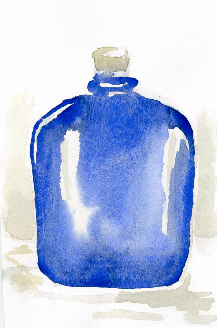
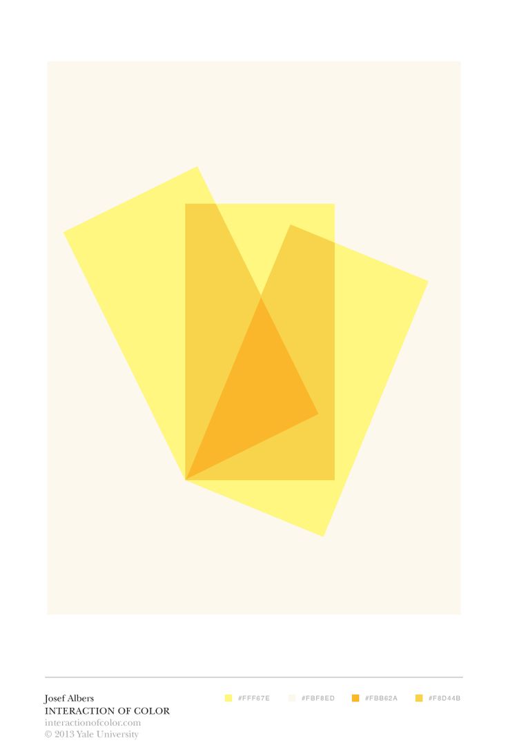
The next step after experimenting with surface an color casually is to attempt a specific effect. I could try to illustrate a specific object (let’s say a transparent glass bottle), focusing on color combination. Usually, after I’ve tried a couple things myself, I check back to industry-standard references for designers, like Albers’ Interaction of Color.
Can we create surface on the screen?
We may not need to replicate the texture and roughness of real-world surfaces on the screen with “photoshop” accuracy. Skeumorphism, the style of UI design that focused on mimicking textures as closely as possible, now seems like old news. Screen resolutions have improved for most users, and we now see sharp edges and legible, detailed typography as the new norm.
But rather than completely dismissing surface, I think we should keep it close. I will always consider the mood my color choices set, and whether it is appropriate for the brand. Looking at colors as a set - does the palette feel shiny, transparent - or matte?
One example I’ve enjoyed recently is the color palette of Hubble.
The color palette gives me the vibe of a bright, but not overpowering light - and the color selections feel like the golden hour before sunset, when colors are rich. Hubble’s use of a pastel paired with a richer tone (with no black or over-saturated colors) feels vibrant and comforting at the same time. Physical packaging and printed materials are indeed matte and pleasant to the touch - as I recently found out, having ordered from them :)
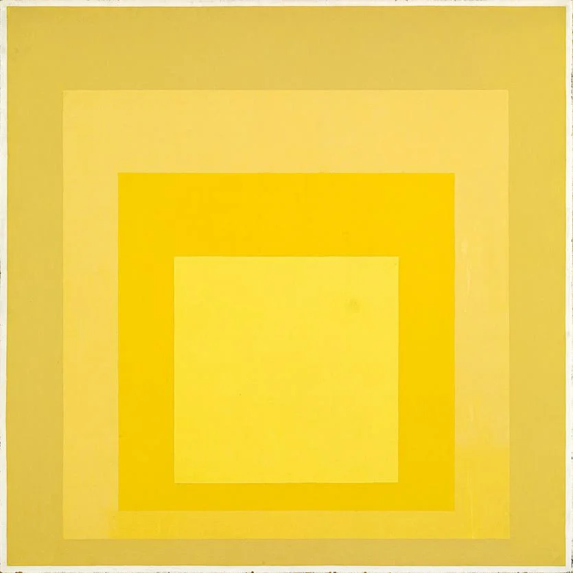
Hubble’s colors, especially the orange-yellow set, remind me of this Albers piece.
A practical summary to all this: think of UI color choices as a palette set, not individual decisions. Reference the textures and lighting in the real world to help decide what the relationships within that palette should be. With the right relationships between colors to set the mood, we can reinforce the right feeling for the UI, even though we can’t control the physical properties of users’ screens. If nothing else, it’s a great excuse to play with colors for work related reasons.


